
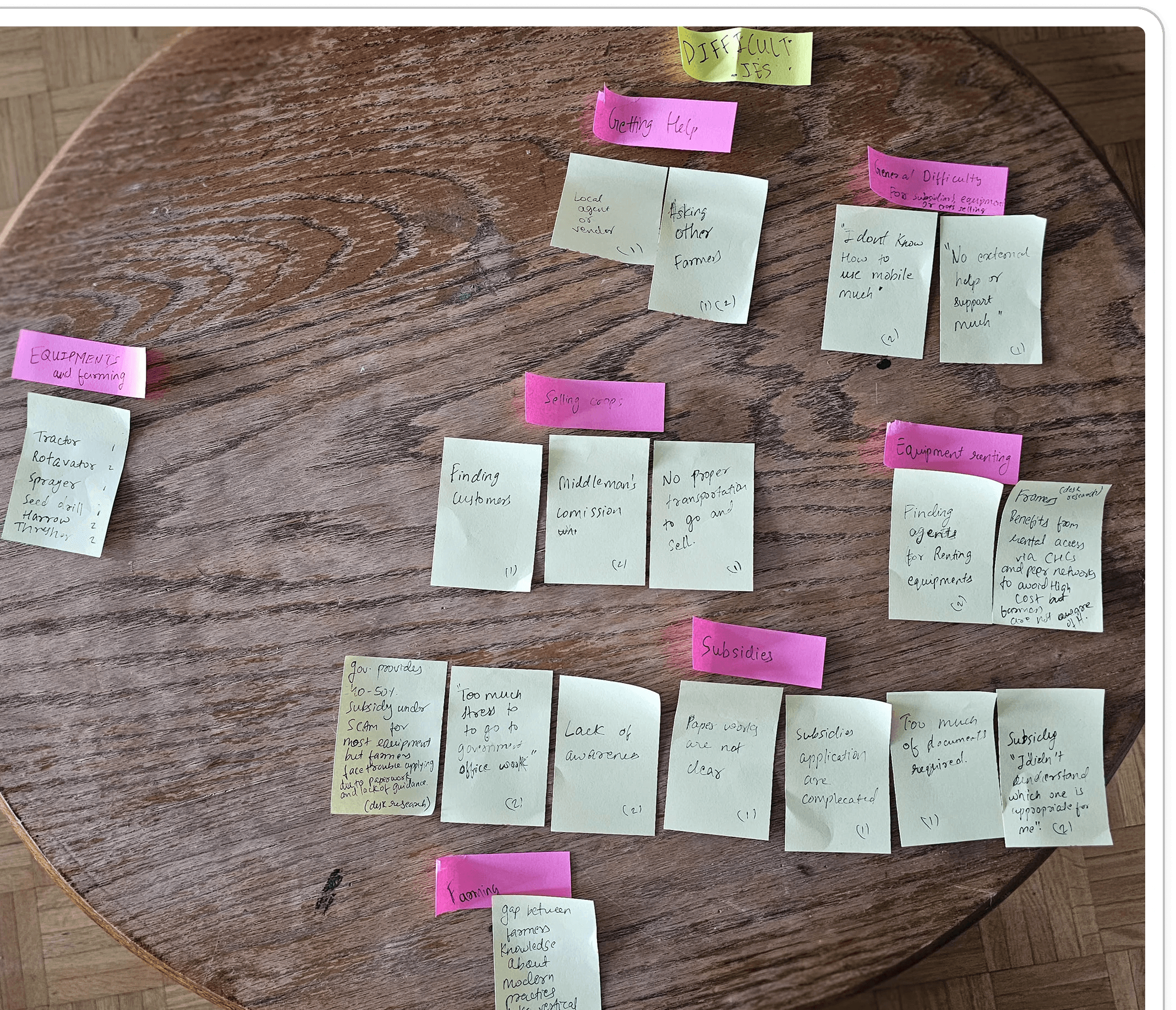
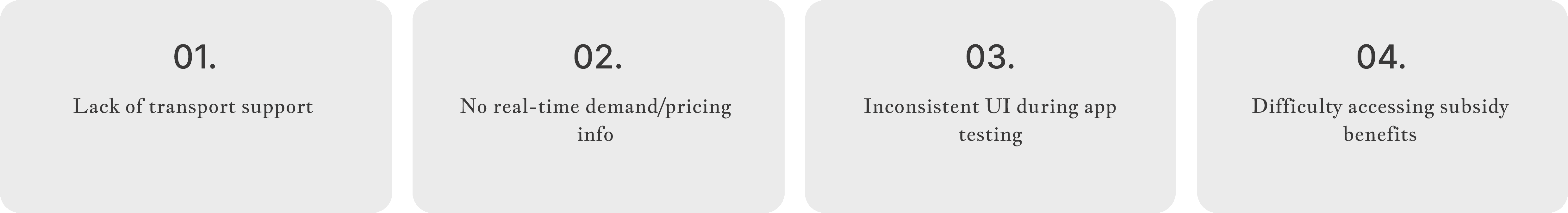
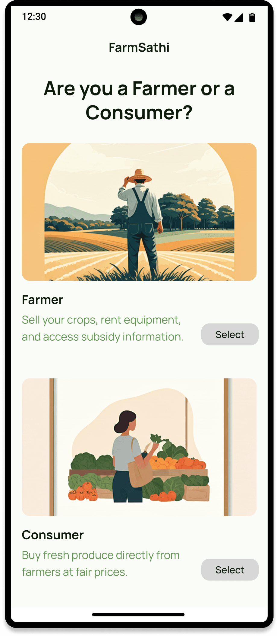
• Farmers: face challenges such as middlemen, exploitation, lack of awareness about, subsidies, difficulty accessing equipment, and selling directly to customers.
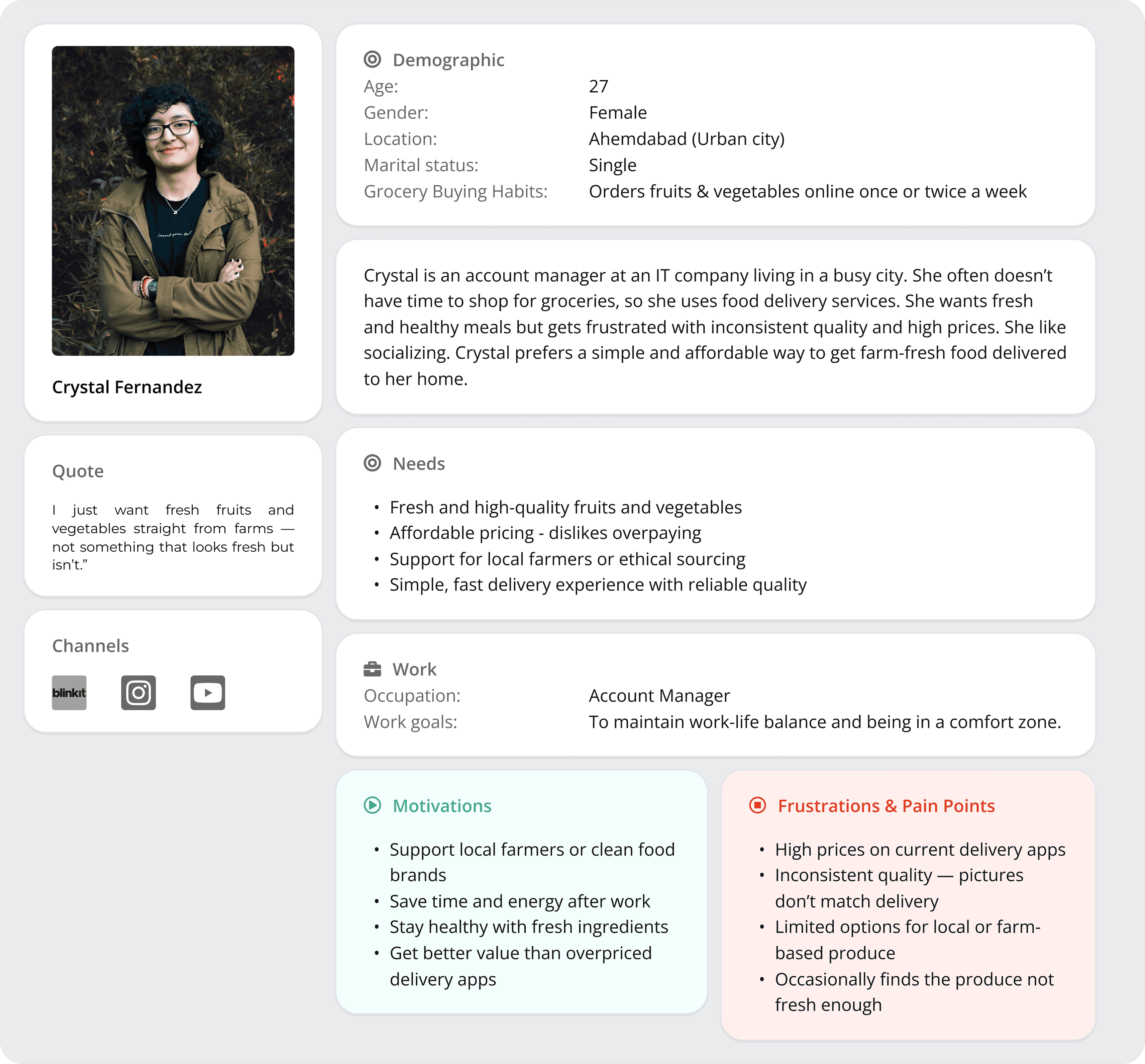
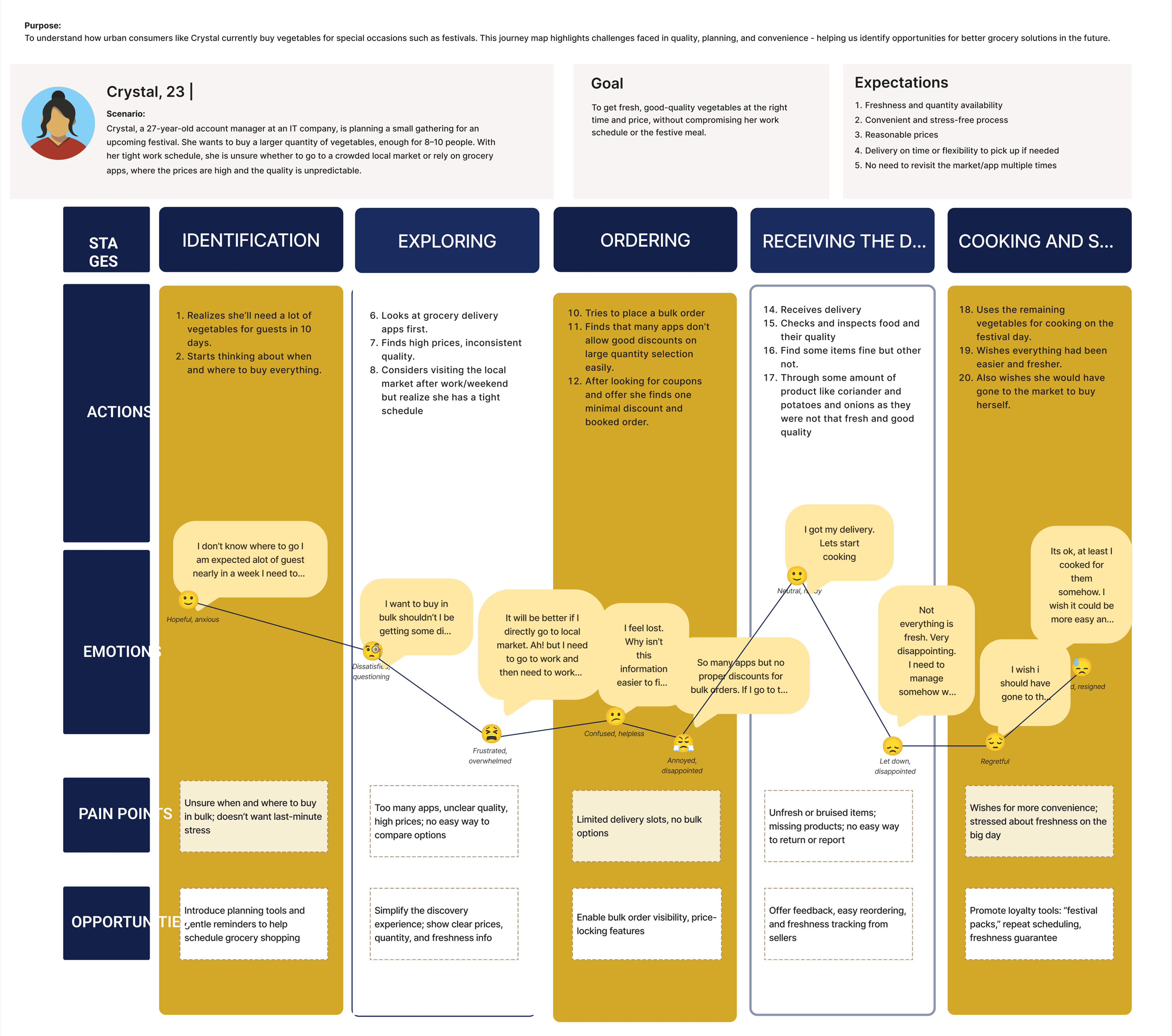
• Urban consumers; struggle with freshness, price transparency, and knowing the source of produce.
• We as designers: While building this application mainly for farmers it is important to keep in mind that language can be a hindrance.
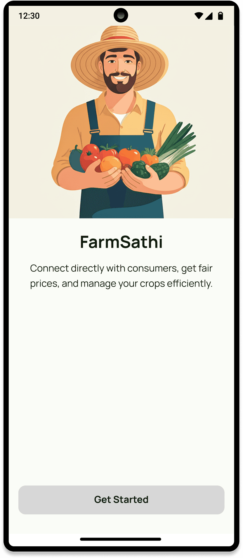
Empower farmers to sell directly and earn better margins
Help farmers access subsidies and equipment easily
Provide consumers with a transparent, fresh produce ordering experience
All user should be able to use it, language should not be a barrier.
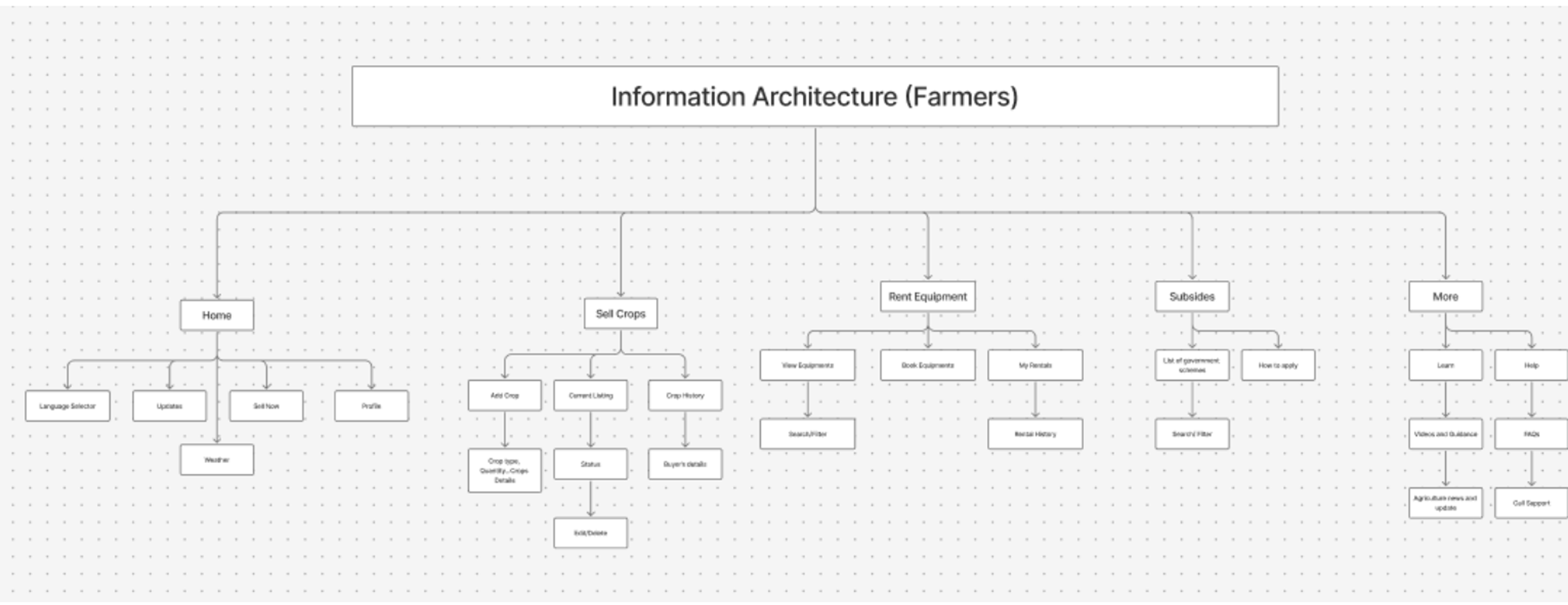
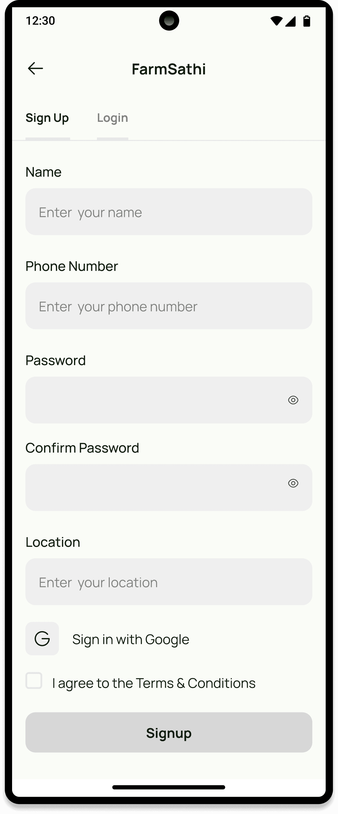
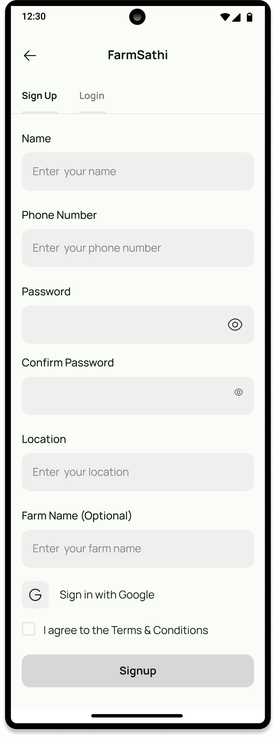
We created a user-friendly mobile app with two portals:
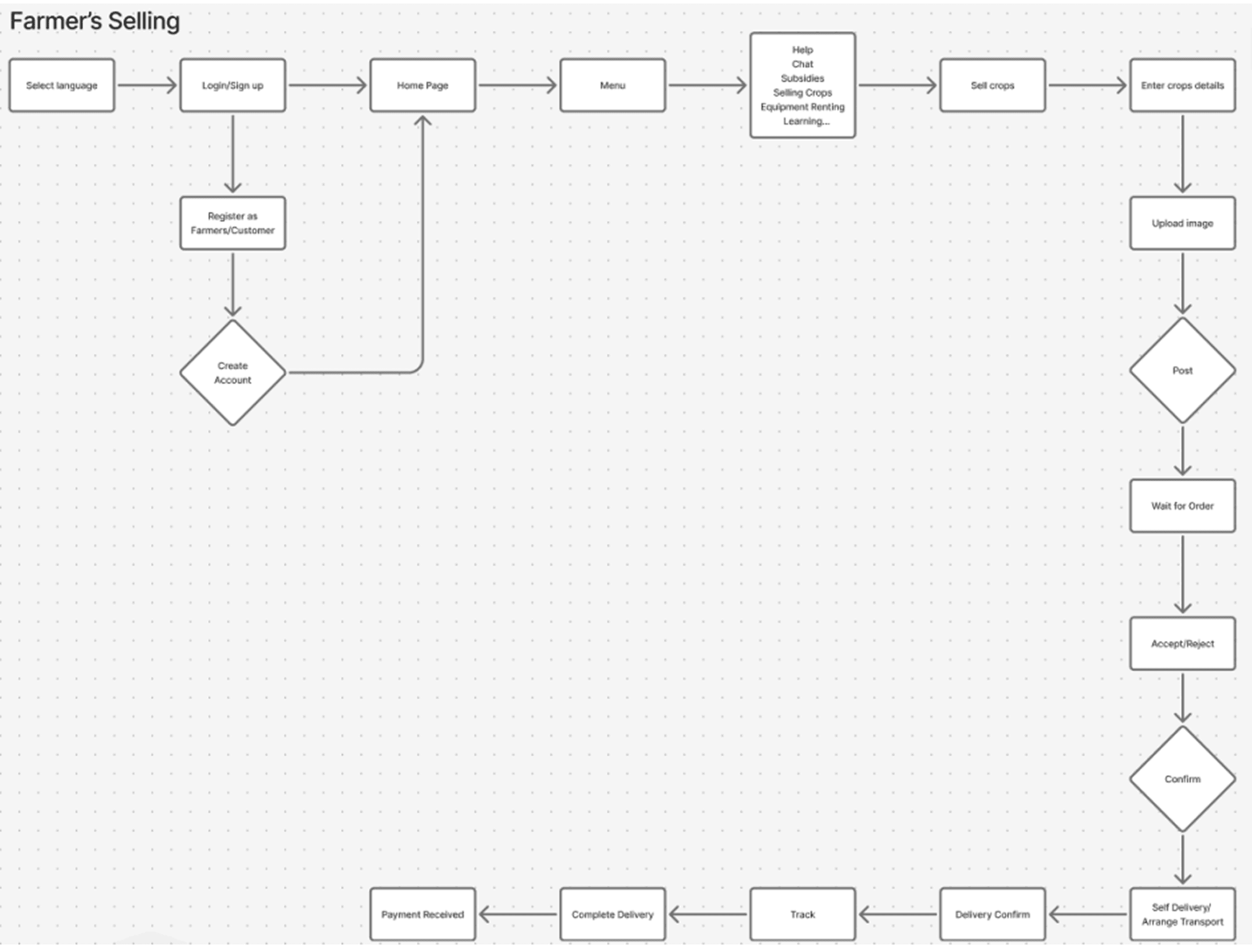
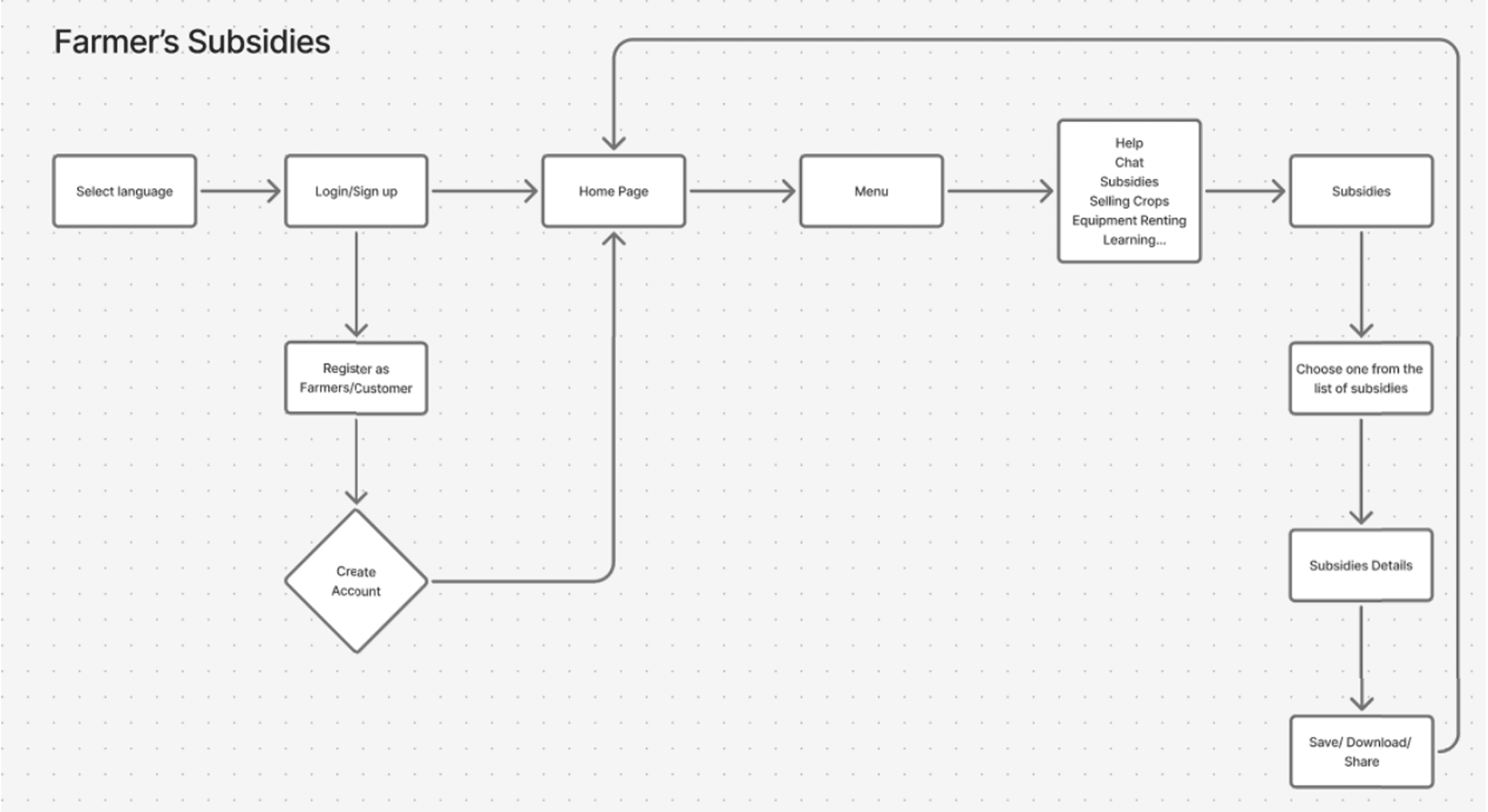
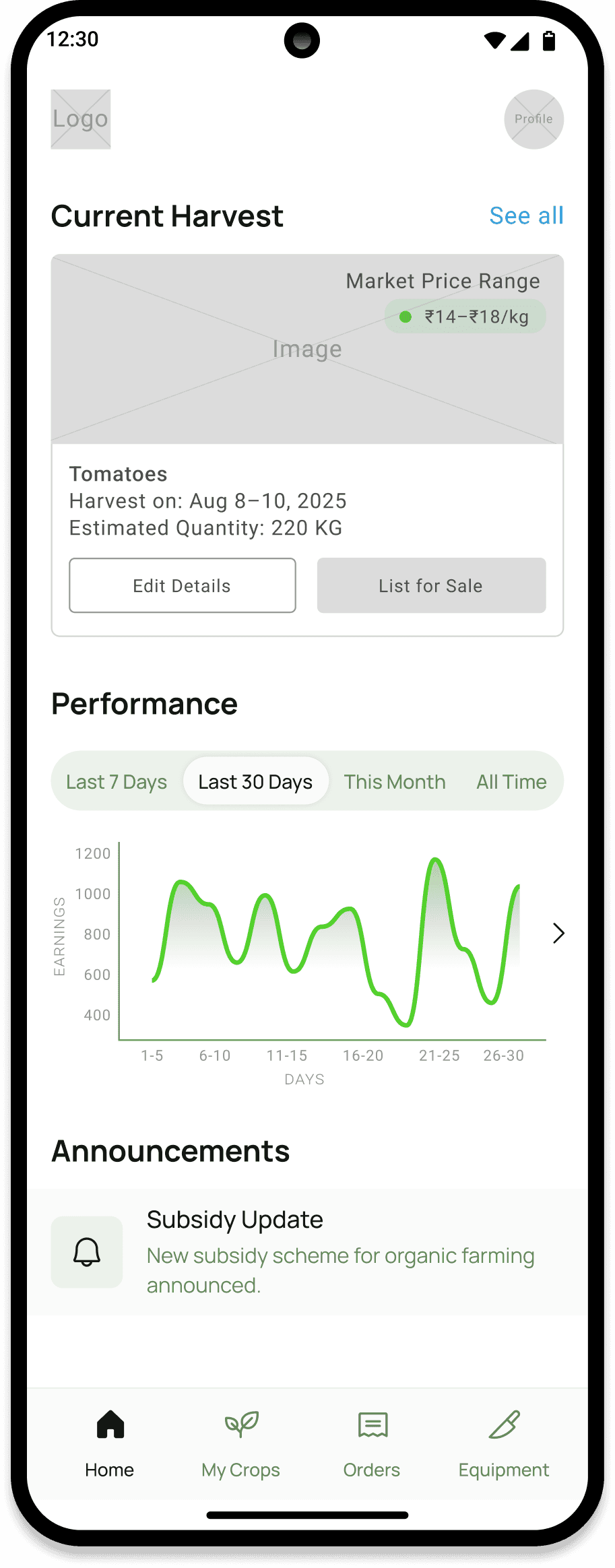
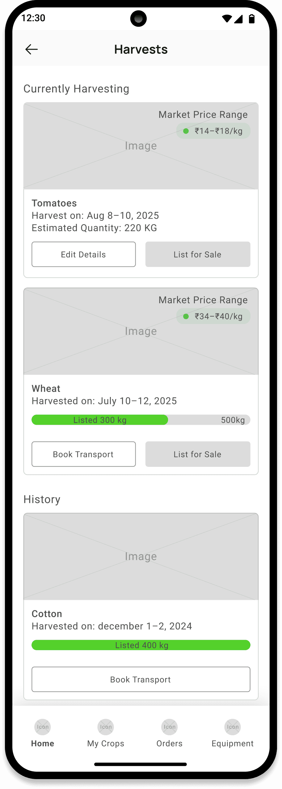
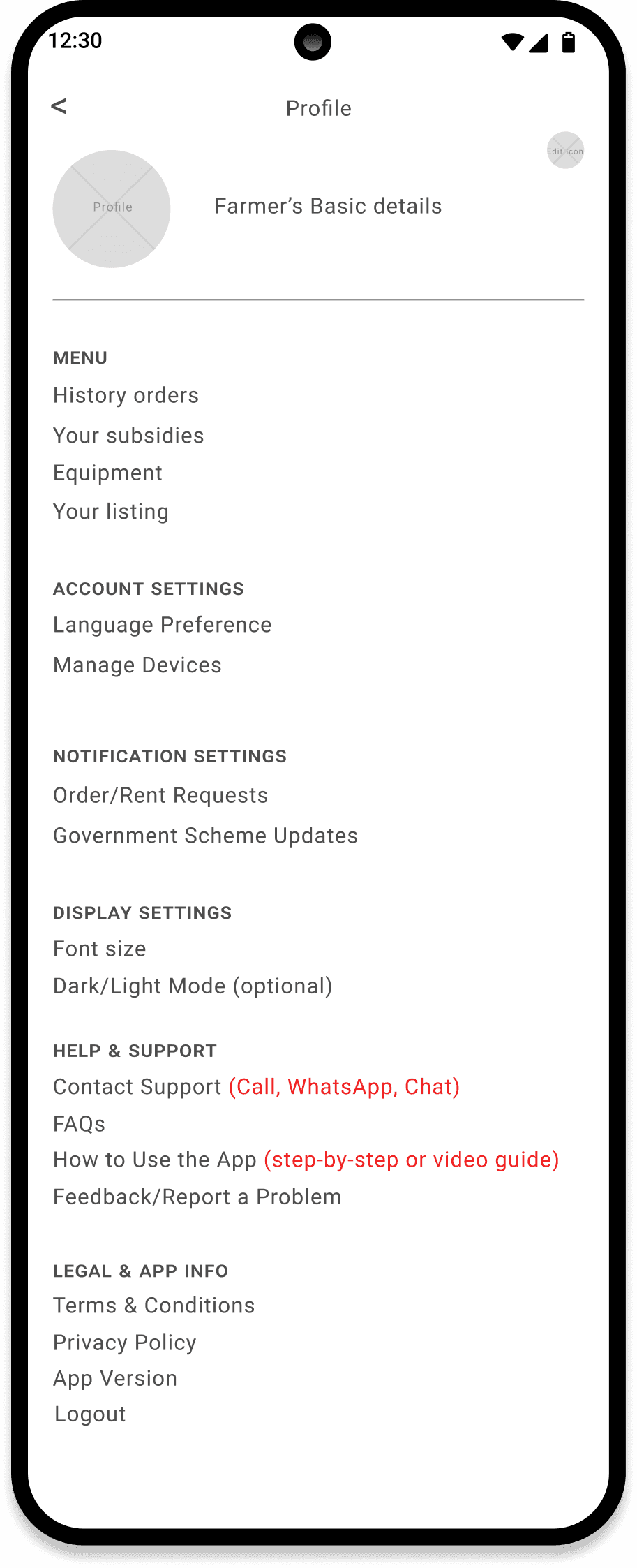
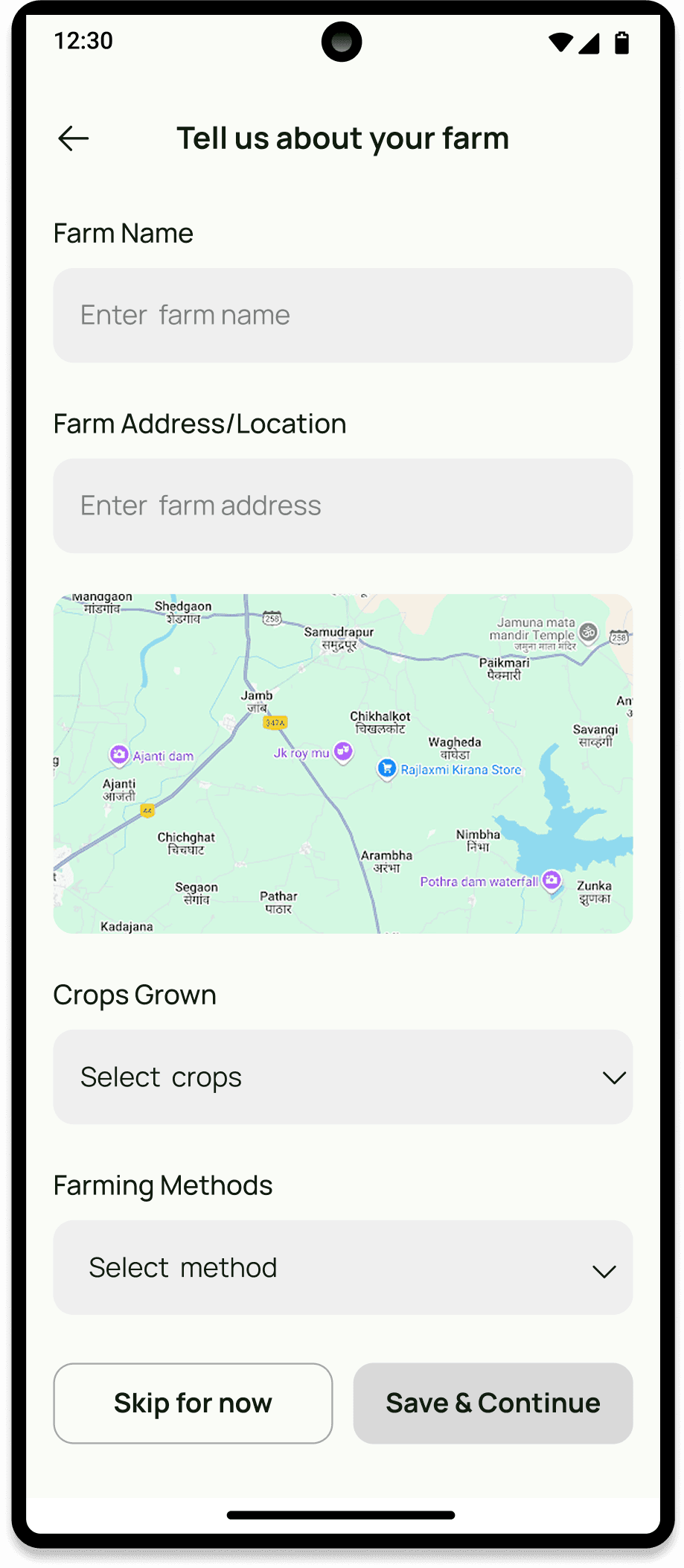
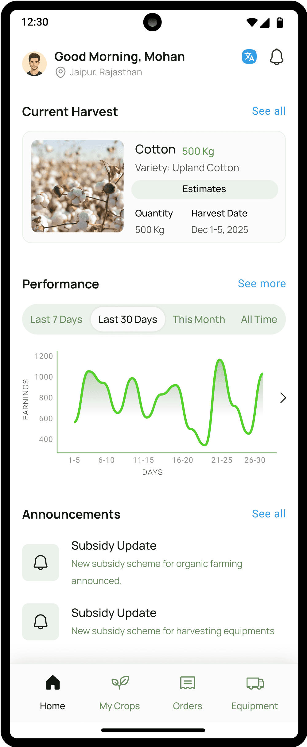
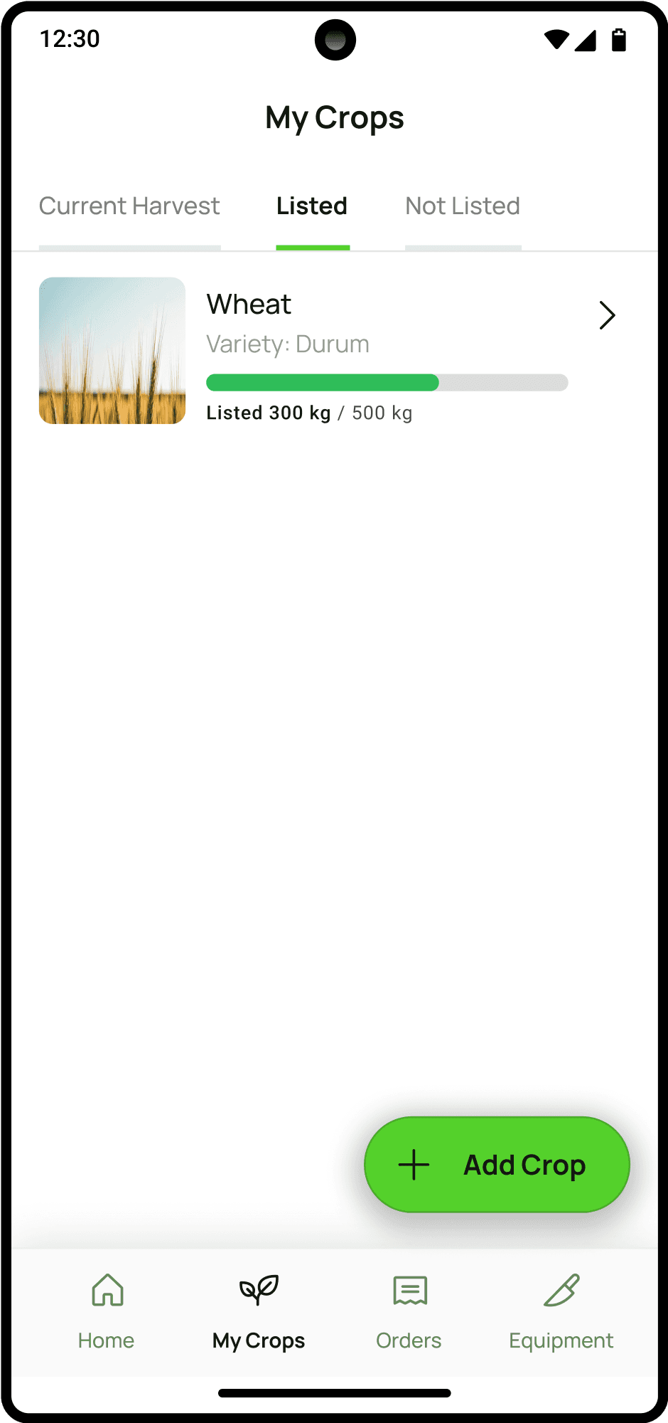
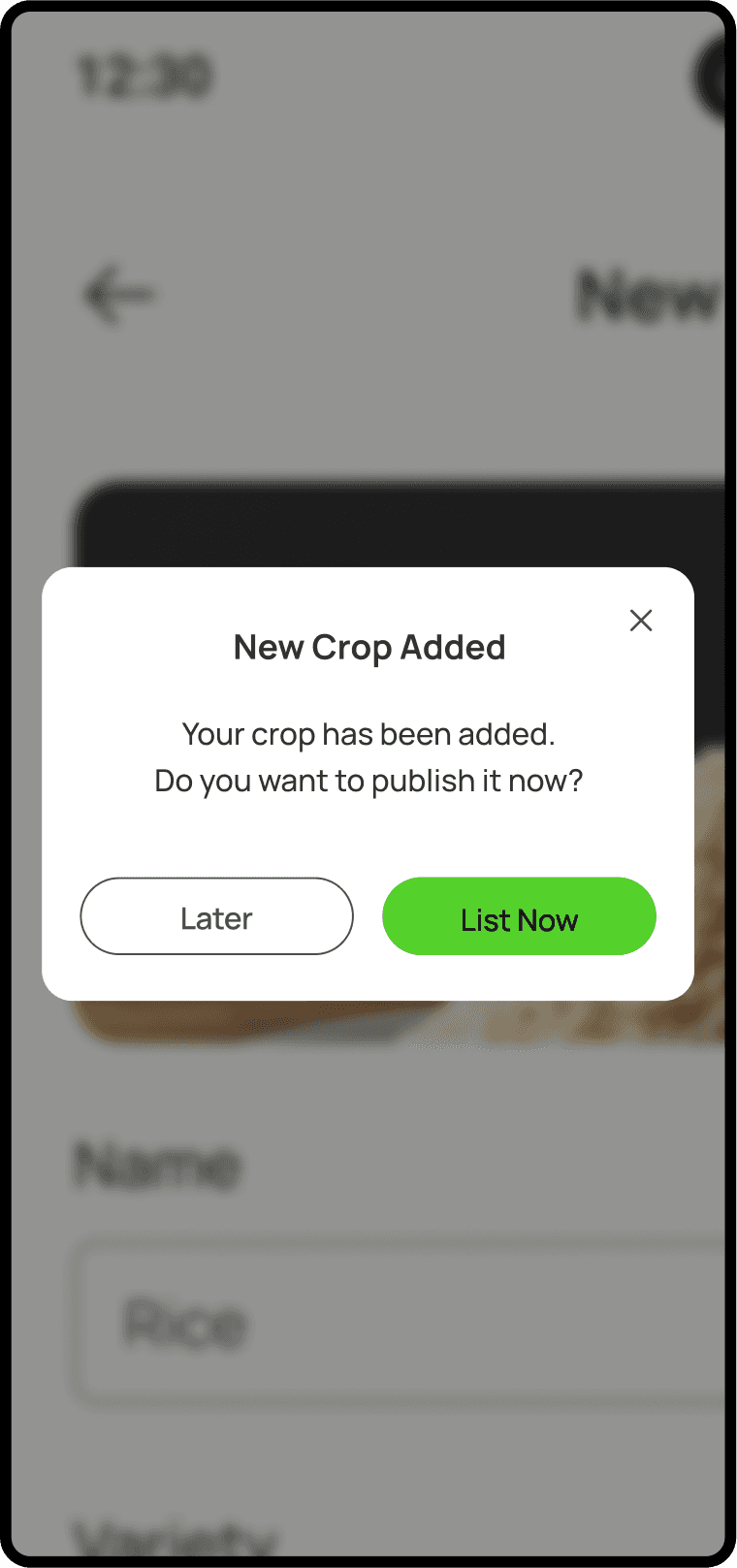
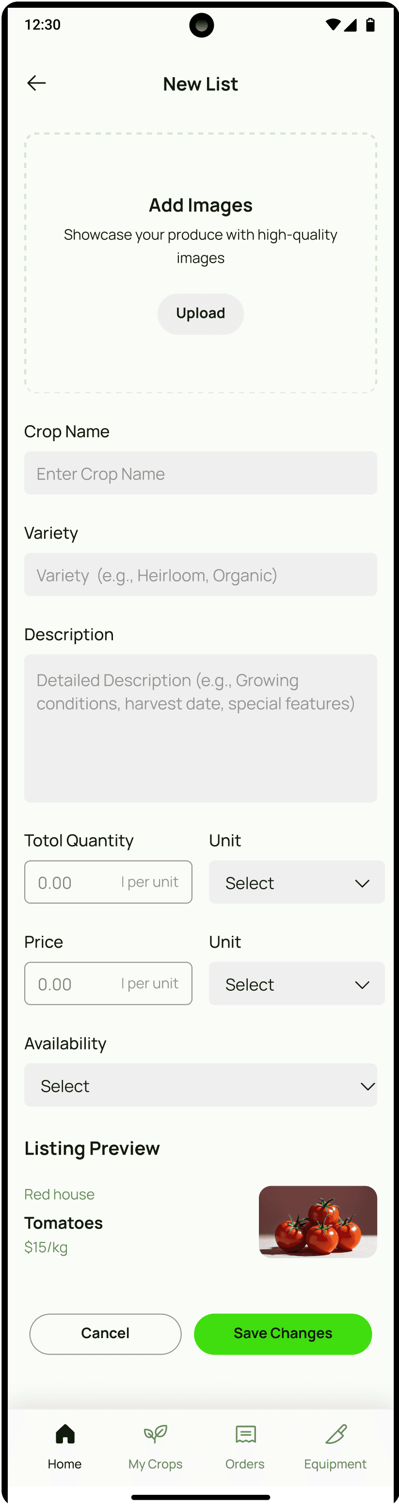
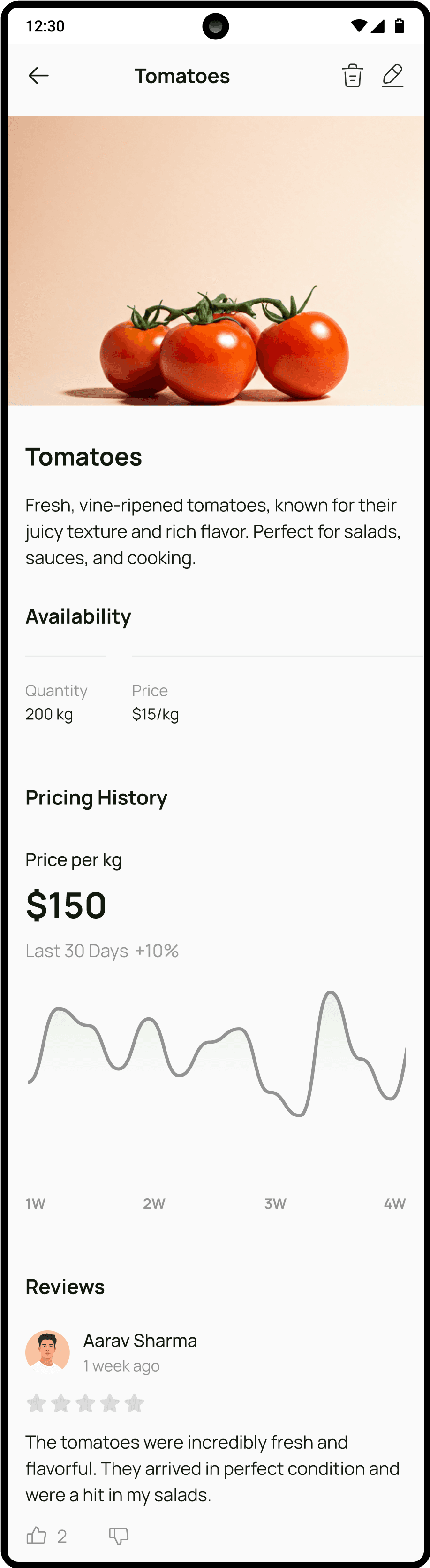
Farmer Portal: Crop listing, subsidy info, equipment access, and crop market range information.
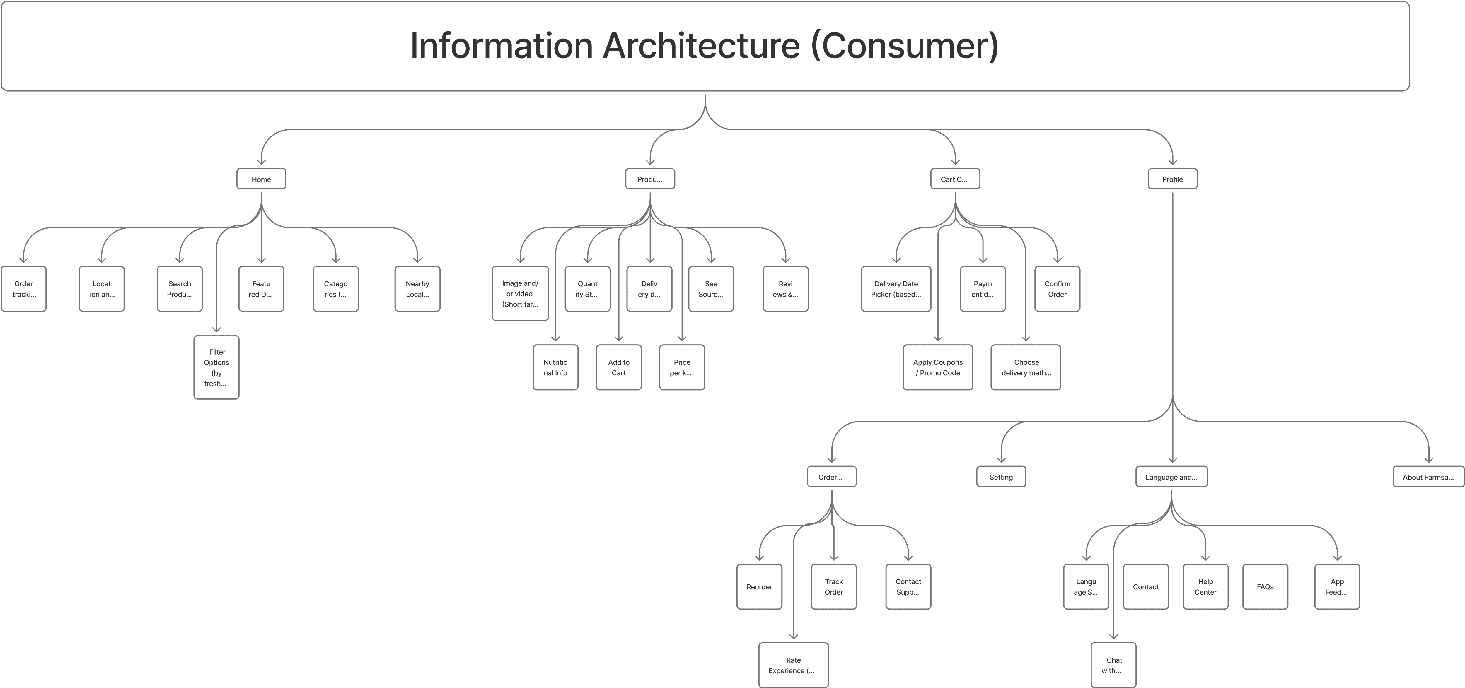
Consumer Portal: Fresh produce discovery, trust- building through farm origin, easy ordering, and delivery tracking
Provide language change feature which will increase the accessibility and understanding.
Accessing healthcare at Humber College is challenging due to long wait times, inefficient booking and limited access to medical records. Our design process focuses on understanding student needs, identifying key pain points, and developing a seamless healthcare experience through digital solutions.
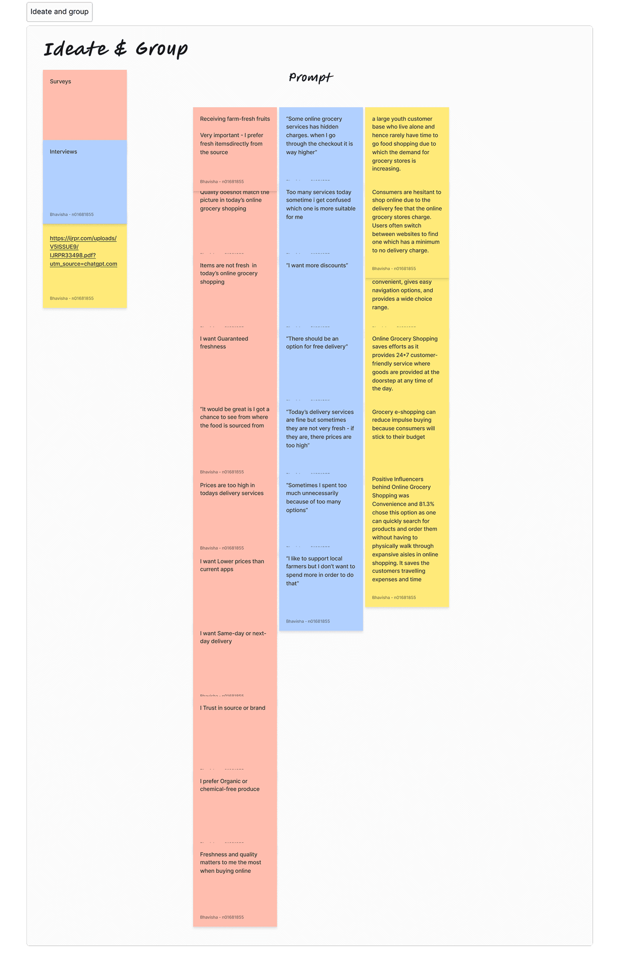
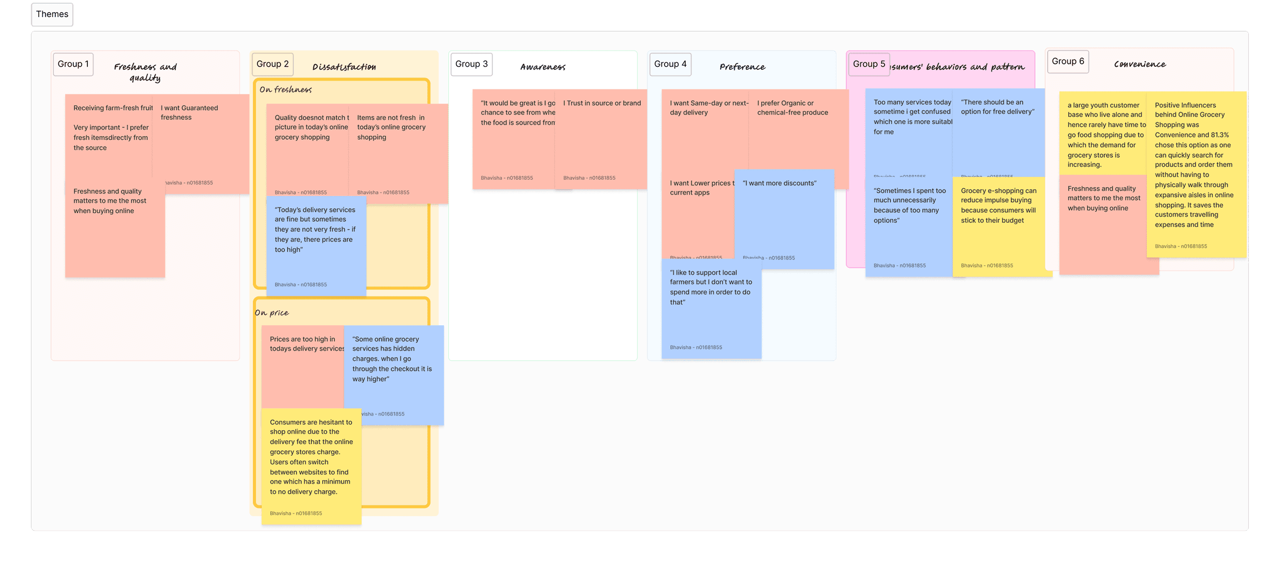
We conducted surveys and affinity mapping and performed desk research for both farmers and consumers:
• Farmers preferred help with government schemes, fair pricing, and bulk transport options.
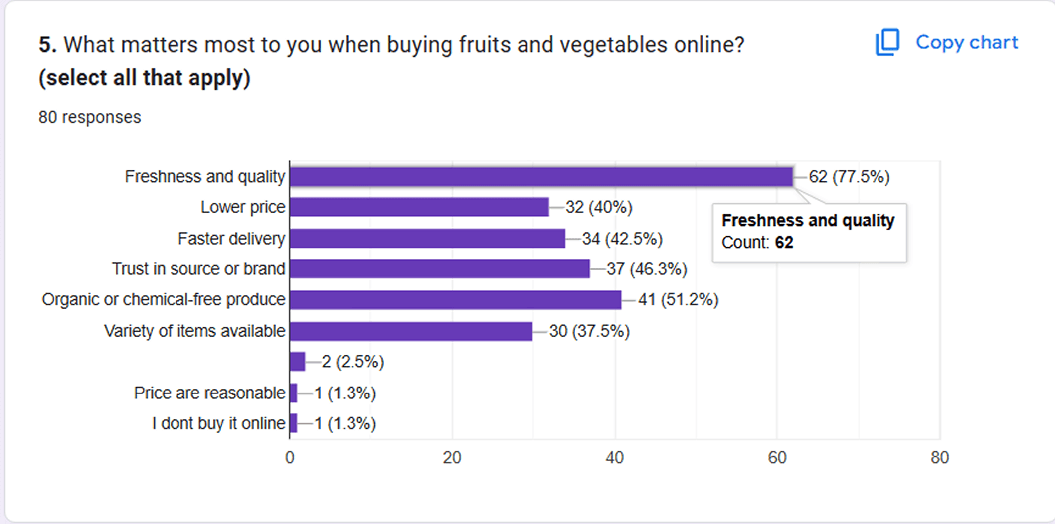
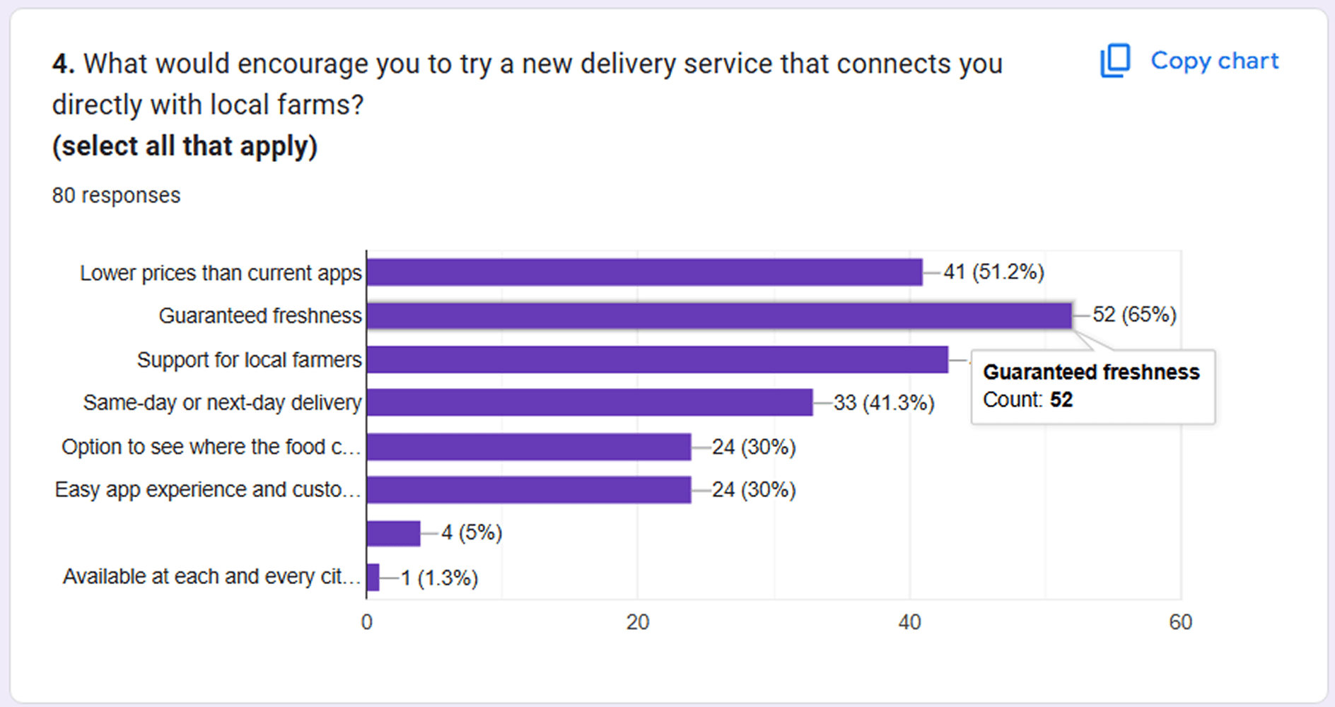
• Consumers wanted freshness, trust in source, fast delivery, and support for local farms.
A survey was conducted for consumers and for farmers it was on One-on-One meeting for a detailed interview.
80% farmers unaware of how to apply for subsidies.
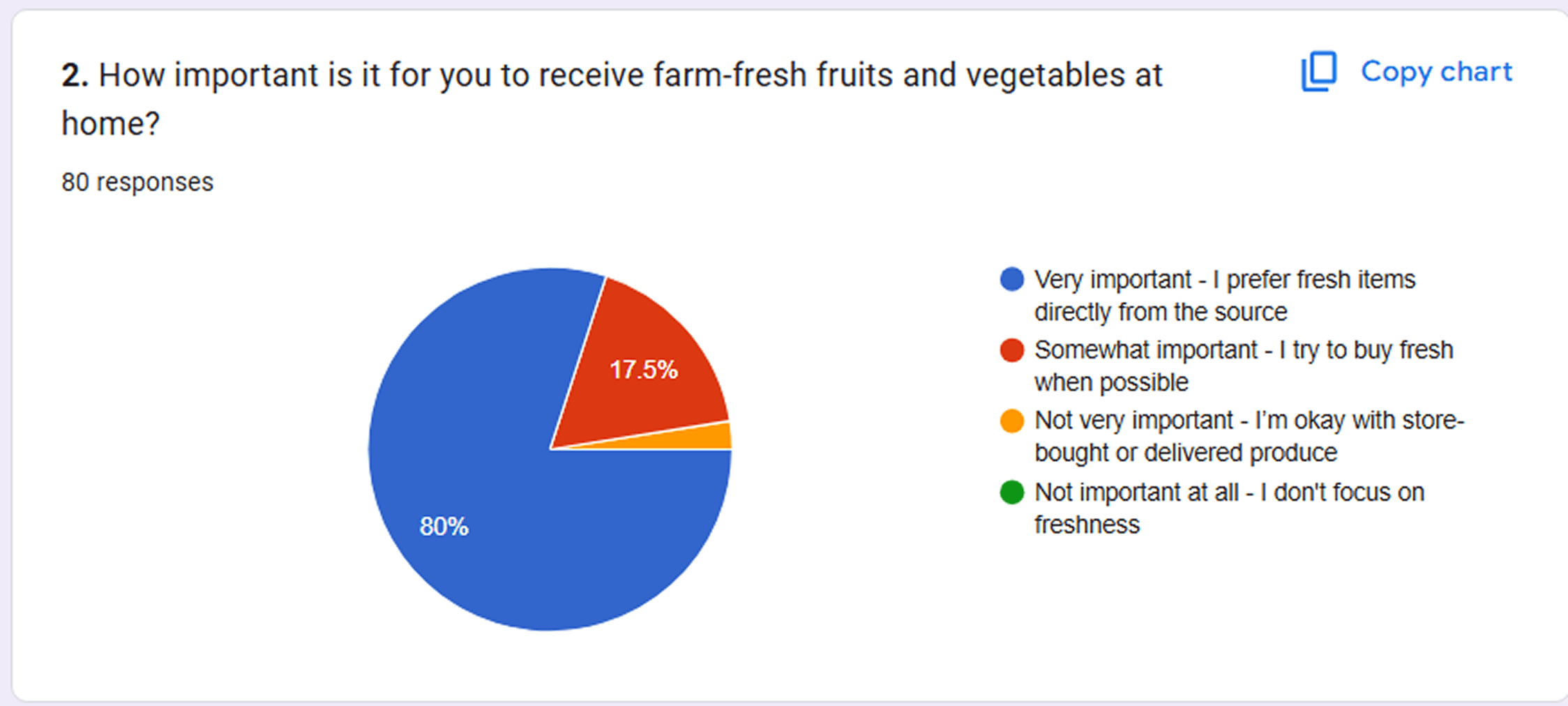
More than 70% consumers cared more about quality and freshness than pricing.
60% farmers struggled with equipment availability or renting process.
- Below are results of primary research for consumer survey
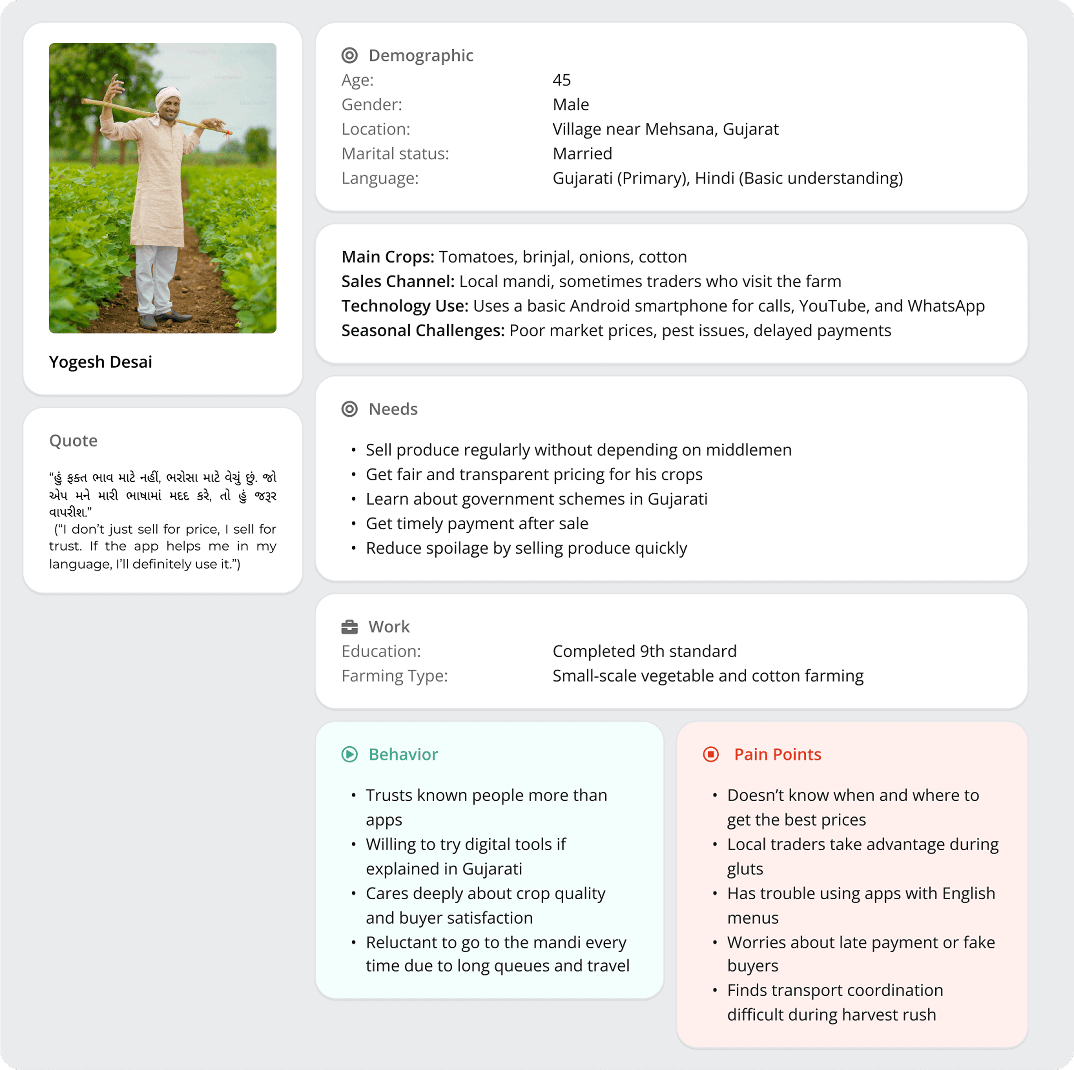
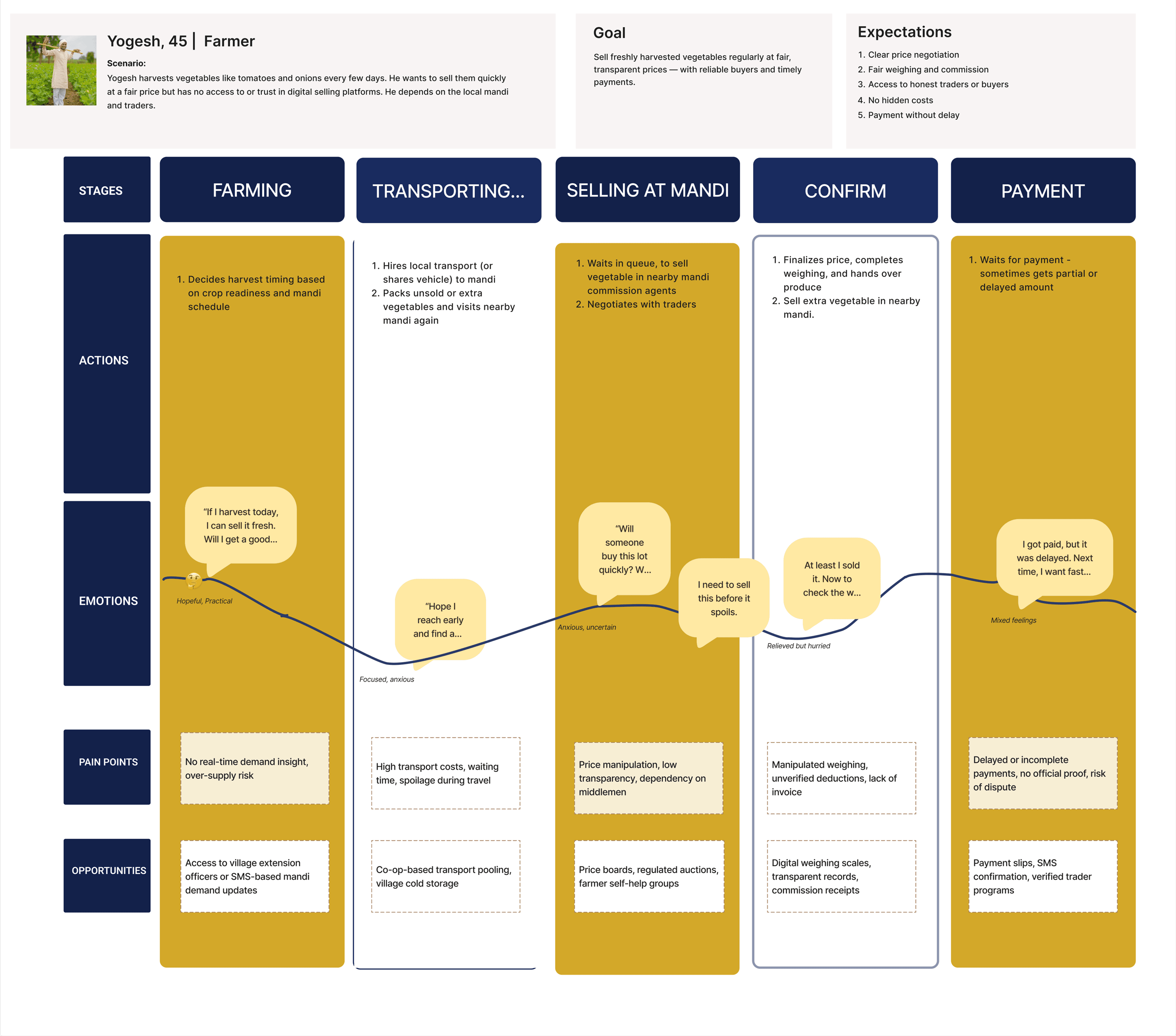
Farmer's Scenario: User Flow for renting equipments from other farmers.
Farmer's Scenario: Finding Information of Subsidies
Consumer's Scenario: Purchasing crops and delivery tracking
Below screens are Dashboard, Current Harvest and Settings page's initial wireframes
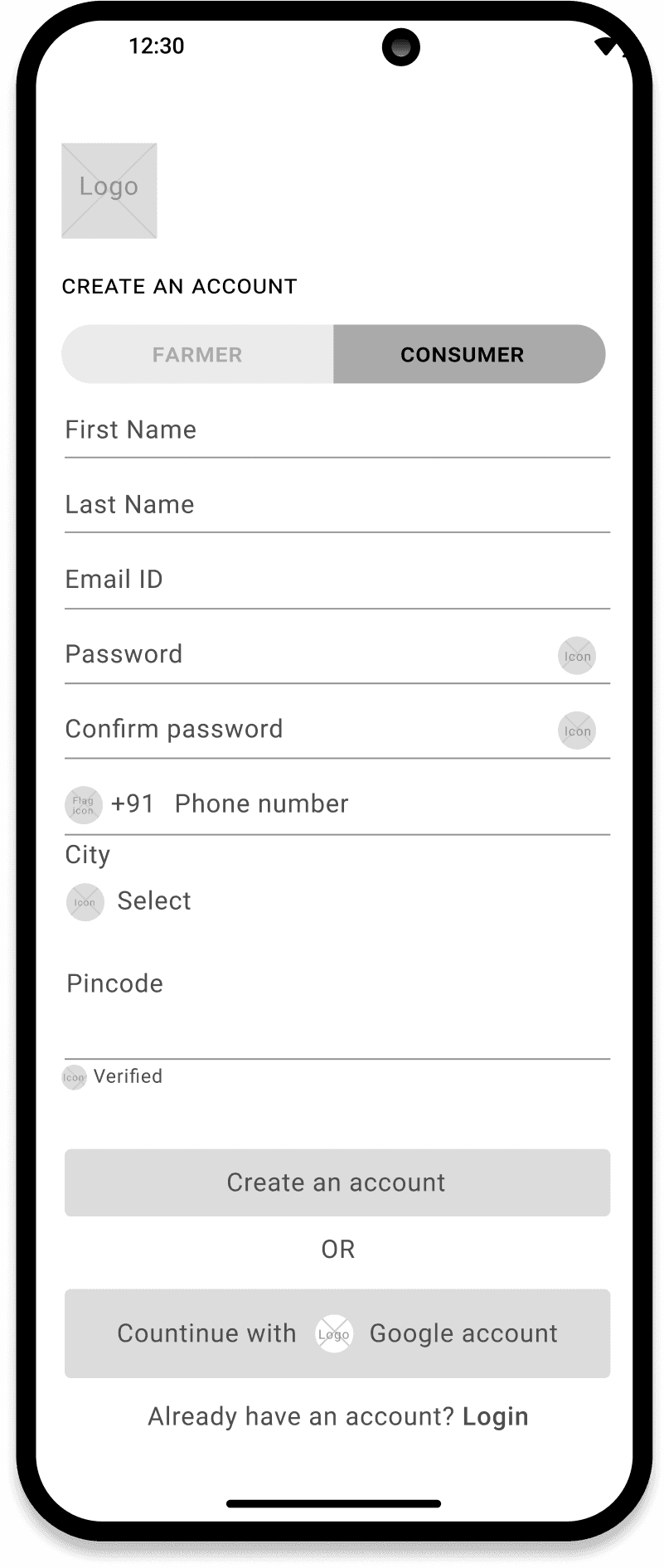
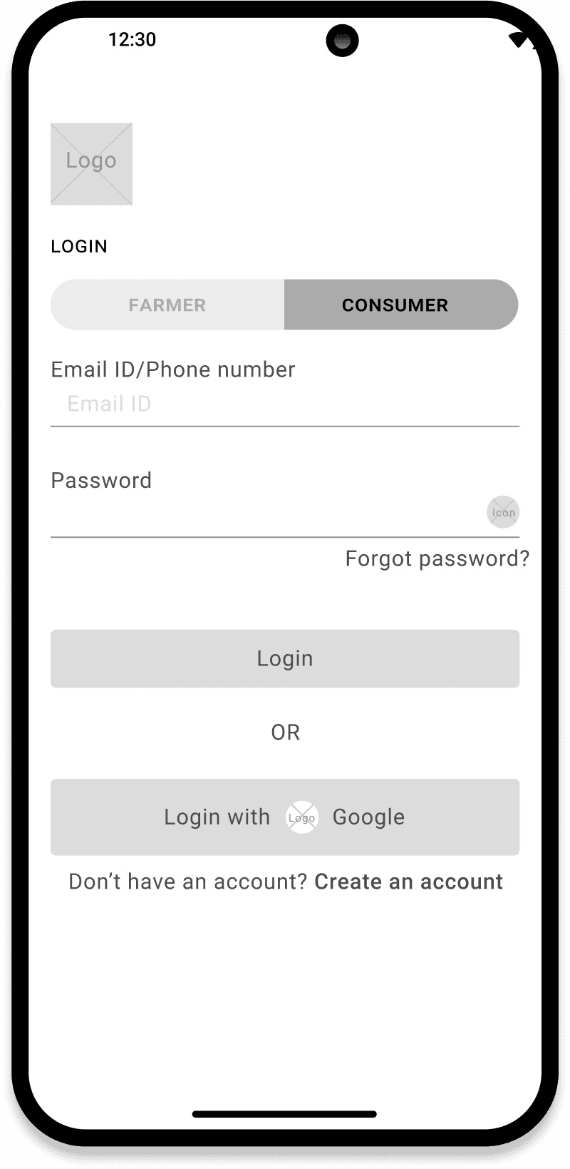
Login Process for framers and consumer:Before
Dashboard: Usability Testing Comments
Unwanted Quick actions
Too many details
Changes made
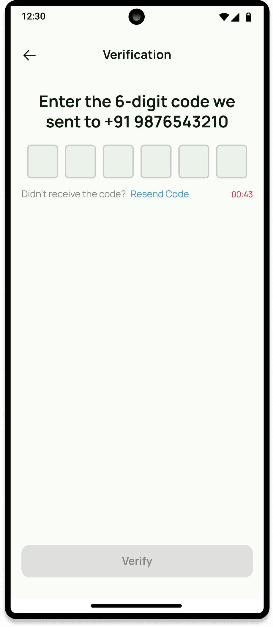
Separated login for clarity.
Moved subsidies into crop detail page for relevance.
Unified card layout across screens (e.g., Equipment screen now matches My Crops).
Dashboard redesigned with charts, quick actions, and announcements
Combined login for farmer & consumer
Bottom nav structure
Screen layouts
Learning about the different needs of farmers in various areas\
Designing for people with low experience using smartphones
Making complex farming ideas easy to understand in the app
Creating content that works in both English and local languages
Keeping the app light and fast for slow internet connections
"We talked to farmers to understand their problems better. Then, we made the app easy to use by adding big buttons, simple words, and helpful pictures. To make sure everyone can understand, we added both English and local language. We also kept the app small and light so it works well even with slow internet. This helped farmers use the app without any trouble."
"Through this project, we learned how important it is to listen to real users before designing. Talking to farmers helped us understand their daily struggles. We saw how small design choices - like using clear words, big buttons, and local languages - can make a big difference. We also learned how to keep things simple so the app works well even in low internet areas. Working as a team taught us how to share ideas and solve problems together."
