
Lahore Chatkhara relied on third-party apps like UberEats, which led to high fees, limited customer insights, and less control over orders. They needed a cost-effective, tailored solution.
A responsive website was designed for both mobile and desktop users, custom online ordering system was built with features like an easy-to-use menu, secure payments, and account/guest checkout options. This reduced reliance on third- party apps, boosted profits, improved the customer experience, and enabled data collection for marketing.
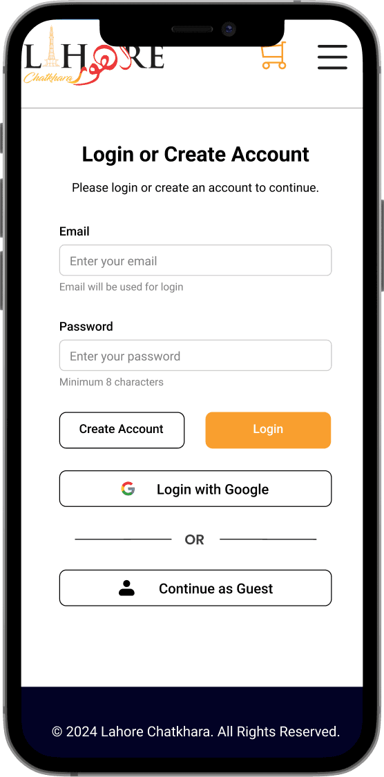
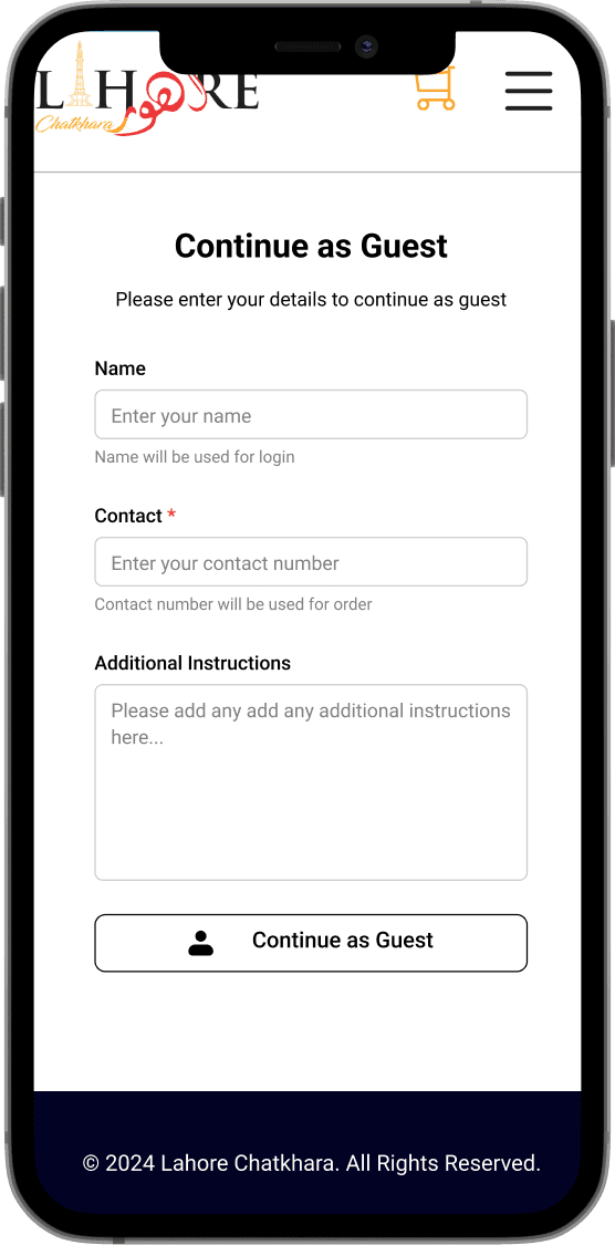
Added a Guest Login option, letting users browse and shop without signing in, making the process simple and convenient.
Integrated secure online payment options, supporting multiple methods like credit/debit cards and digital wallets, to provide a smooth and hassle-free checkout experience.
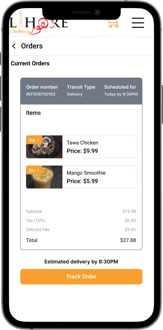
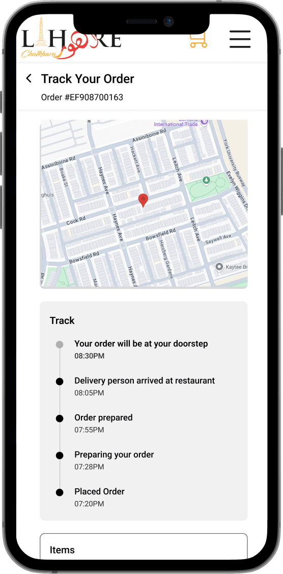
Implemented a real-time order tracking system, allowing users to monitor their order from confirmation to delivery, ensuring transparency and reliability.
Feature Lists
Browse Menu with Clear Categories: Organized sections like mains, drinks, and desserts.
Cart Management: Add, remove, edit items, view cost breakdown, and save carts.
User Accounts or Guest Checkout: Options for quick or personalized orders.
Payment Gateway: Secure payments with cards and digital wallets.
Order Tracking: Real-time updates for delivery and pickup orders.
Customization Options: Personalize dishes (e.g., toppings, spice levels).
Responsive Design
Works seamlessly across devices.
Target Audience
First time users
Regular customers
People who are ordering for delivery or takeout
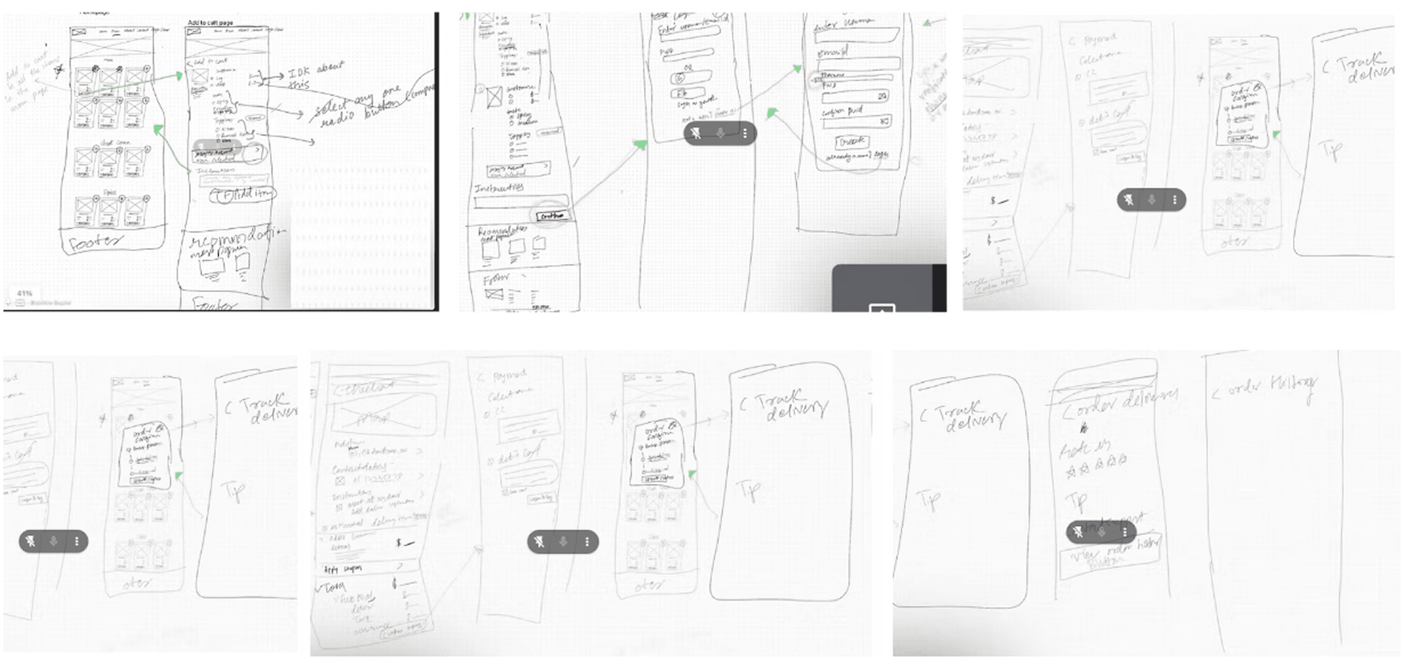
Paper Prototype
We created paper prototypes after completing the wireflows to quickly visualize and generate ideas for the design. This approach allowed us to test concepts efficiently and refine them before moving to the next stage. After creating the paper prototype, we gathered feedback to refine the design for wireframes. A key challenge was balancing usability for both desktop and mobile screens, ensuring the mobile interface wasn't overcrowded and the desktop layout wasn't empty. The main feedback gathered was on simplifying navigation and improving customization. The sketches helped us quickly test ideas and identify improvements while ensuring consistency across devices.
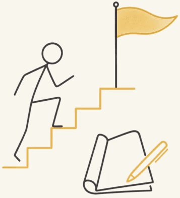
Our Next Steps
Our next steps involve creating wireframes, testing user flows to validate the design, and building a cohesive design system. This will ensure a seamless and intuitive ordering experience across both desktop and mobile platforms.
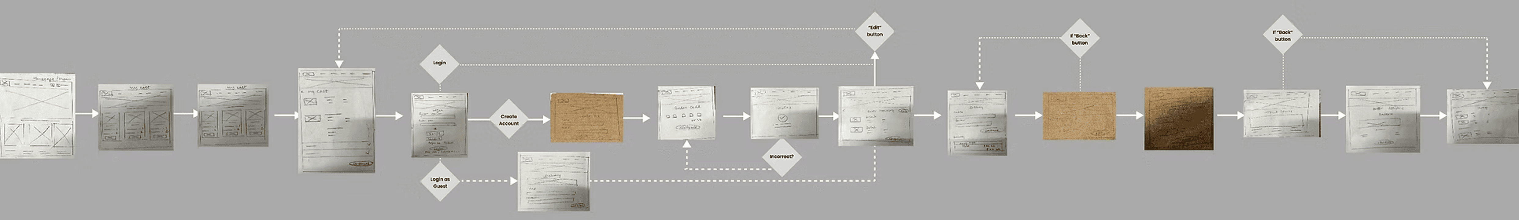
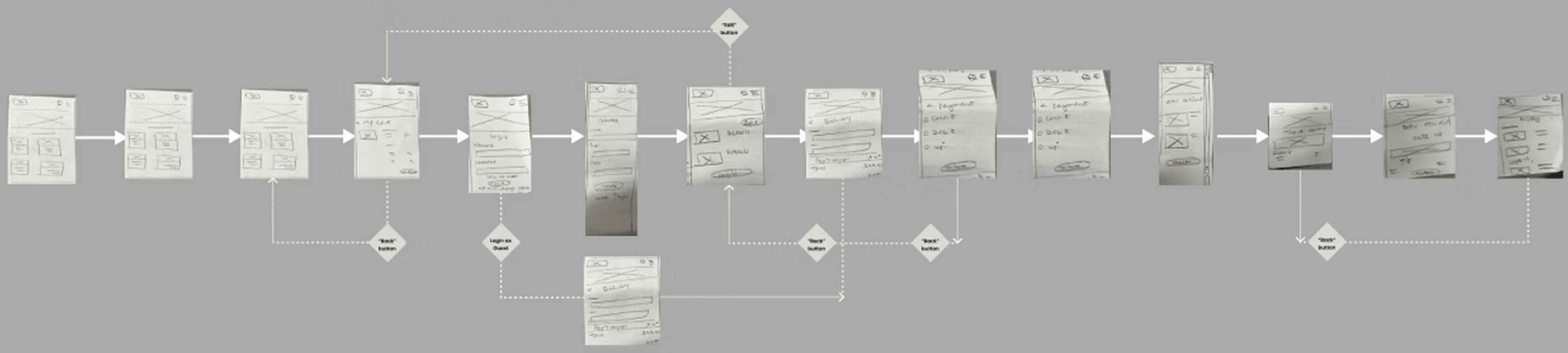
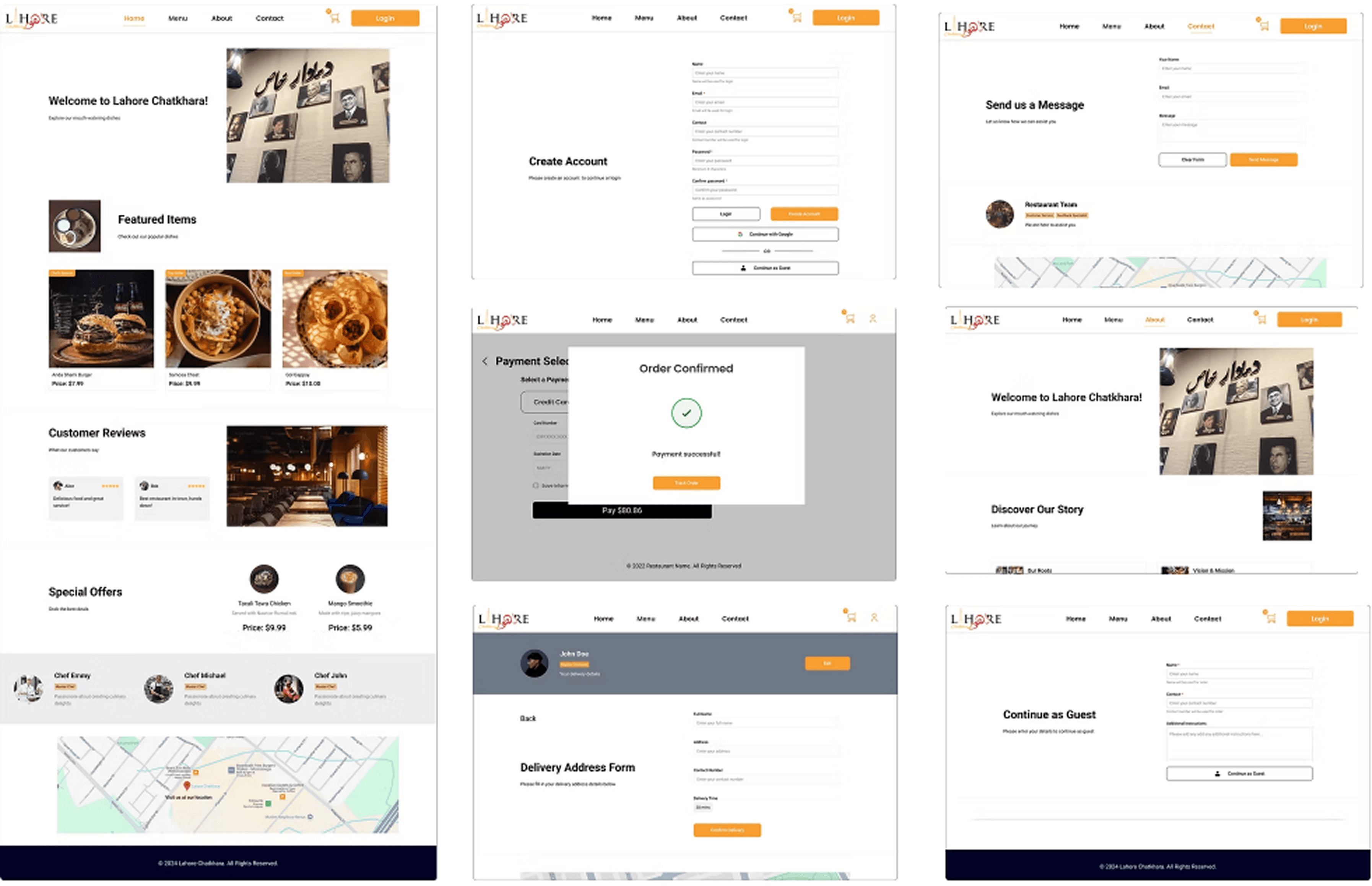
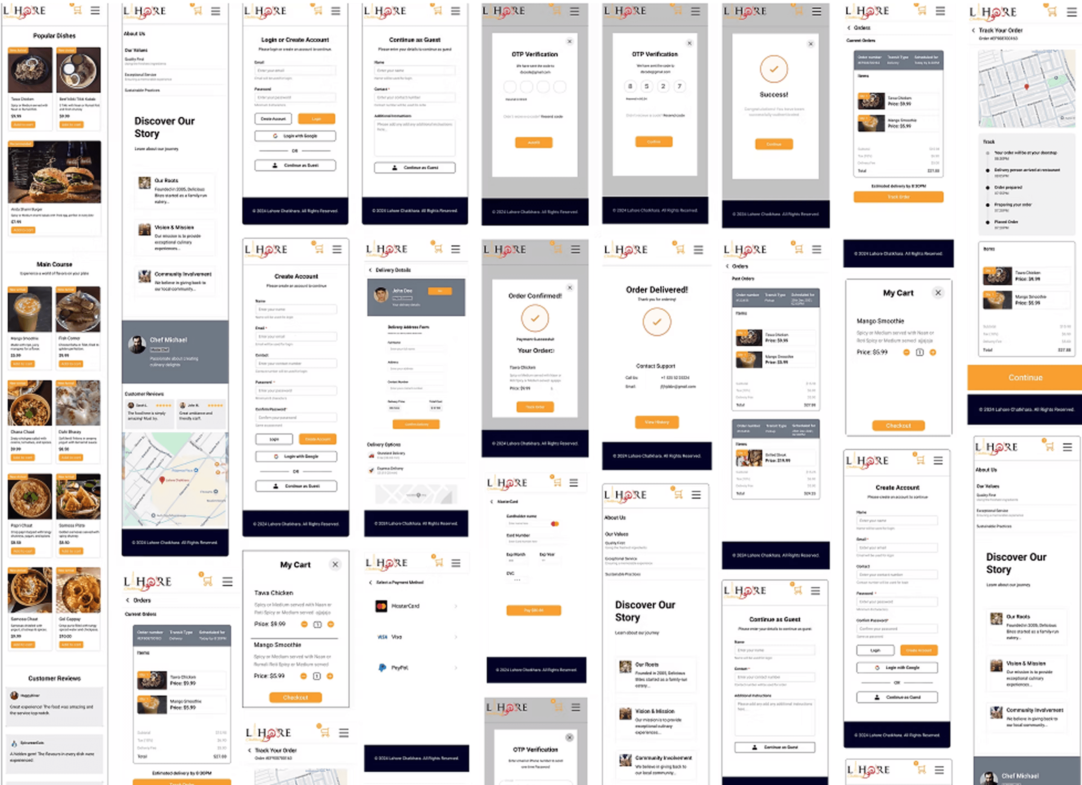
Below are the web flow created for Website and mobile view
Problem 1:
Frustration with mandatory login users feel frustrated when asked to login on their first visit.
Our Solution:
We added a Guest Login option, letting users browse and shop without signing in, making the process simple and convenient.
Problem 3
Order Tracking
Users lack visibility into their order's status, leading to uncertainty.
Our Solution
We implemented a real-time order tracking system, allowing users to monitor their order from confirmation to delivery, ensuring transparency and reliability.
Integrated online payment options.
Login as a guest feature added to solve the problems faced by users
Delivery methods and order tracking implemented.

"As a team, we had to manage tight timelines, align design decisions quickly, and communicate effectively across roles to stay on track. On the project side, the biggest challenges were improving menu navigation, fixing cart usability, simplifying the sign-up process, and making the design mobile-friendly, all while ensuring the user experience stayed smooth and visually appealing."
"We worked closely as a team, dividing responsibilities and aligning on design priorities early. We restructured the menu with clear categories, made the cart more user-friendly, and added a guest checkout option. The UI was redesigned for mobile, and we introduced live order tracking and customization options to enhance the user journey."
"Through this project, we learned team coordination and fast iteration helped us meet our goals without compromising on user needs. We learned the value of building with empathy - features like guest checkout, mobile-first design, and customization made a big difference. Clear roles and open communication kept the process smooth and focused."